You work hard on your blog. You publish helpful content, optimize for keywords, and even share your posts consistently.
But if your traffic isn’t sticking—or worse, bouncing in seconds—then the issue may have nothing to do with what you’re saying… and everything to do with how your blog looks and feels.
Design mistakes are like background noise: your readers can’t always describe what’s wrong, but they feel it—and leave because of it.
That’s the invisible power of UI and UX design in blogging.
UI (User Interface) controls what your readers see—your layout, colors, fonts, spacing, and structure.
UX (User Experience) shapes how they feel—how easily they navigate, how fast your pages load, and how confident they are in your site’s trustworthiness.
Most bloggers unknowingly make design choices that repel readers:
- Text that’s too small or hard to read
- Navigation menus that confuse more than help
- Layouts that overwhelm or distract
- Mobile views that fall apart
These aren’t just visual flaws. They directly impact engagement, SEO, and conversions.
In this post, we’re diving into 35 of the most common blogging design mistakes—a mix of UI missteps, UX blockers, and overlooked trust-breakers.
Whether you’re just launching your site or you’ve been publishing for a while, these hidden problems could be sabotaging your growth without you realizing it.
Here’s what you’ll learn:
You’ve already written the content. Let’s make sure your design is helping it shine—not hiding it.
1- UI Blog Design Mistakes
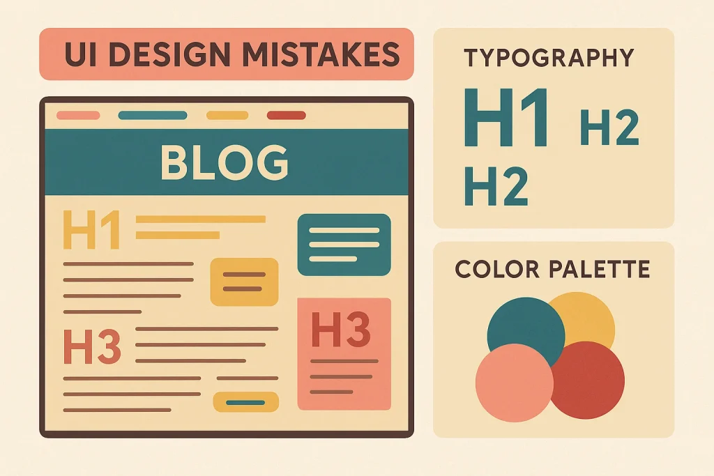
These visual and structural errors directly affect how your blog is perceived. If the interface looks messy, unprofessional, or confusing—readers won’t stick around long enough to hear what you have to say.
1. Cluttered or Overwhelming Homepage
Too much text, too many widgets, or multiple calls to action above the fold instantly overwhelms visitors.
Instead of guiding them, you’re pushing them away with chaos.
Tip: Use white space, visual hierarchy, and a single primary goal (like reading your latest post or joining your email list).
2. No Clear Visual Hierarchy
When everything on your blog looks equally important—nothing stands out.
Readers tend to skim, and if your headings, font sizes, colors, and layout don’t guide their eyes, they’ll skip right past your best content without realizing it.
A clear visual hierarchy shows readers what to pay attention to first, second, and last. Without it, even great content feels hard to process.
Fix: Use progressively larger font sizes for H1–H3 tags, apply consistent padding and margin between sections, and use color contrast to highlight key actions or headlines.
Page builders like Elementor or Kadence Blocks make this process easier for non-designers.
Need help structuring your blog visually?
Check out Canva’s Guide to Visual Hierarchy for real-world examples of layout, text balance, and visual flow.
3. Too Many Competing Elements Above the Fold
Sliders, popups, nav bars, buttons, banners… if your hero section tries to do everything, it does nothing well.
This is one of the most common UI blog design mistakes among new bloggers.
Tip: Stick to one focus above the fold: your value proposition or your best lead magnet.
4. Lack of White Space and Breathing Room
White space isn’t wasted space—it’s what makes everything else readable and beautiful.
Without it, your blog looks crammed and stressful.
Fix: Add margins between paragraphs, widen padding in containers, and increase line spacing.
5. Inconsistent or Unprofessional Color Scheme
If your blog uses too many unrelated colors—or colors that clash visually—it can look chaotic, unpolished, and even untrustworthy.
Readers form opinions in seconds. A mismatched palette distracts from your message and makes your brand forgettable.
A cohesive color scheme not only creates visual comfort but also builds brand recognition over time.
Fix: Stick to 2–3 primary brand colors, and apply them consistently across headings, buttons, and links. Use one accent color for CTAs or highlights. Page builders and themes often include global color settings to help with this.
Want a professional framework?
Explore Google’s Material Design color guidelines to understand how designers apply consistent color rules across web interfaces.
6. Poor-Quality or Misaligned Images
Blurry images, distorted proportions, or poorly cropped visuals immediately lower perceived value—even if your content is solid.
Fix: Use high-resolution images (optimized for web), keep visual ratios consistent, and align them purposefully within your content.
7. Overuse of Stock Photos Without Relevance
Generic stock photos (like “man pointing at laptop”) make your blog feel lifeless.
Worse: using unrelated visuals can confuse the reader and dilute your message.
Tip: Use context-aware photos, custom graphics, or screenshots that support your post—not just decorate it.
8. Too Many Font Styles Used Together
Using a different font for body, headings, CTA, and quotes can make your blog feel disjointed and amateurish.
Fix: Choose no more than 2 font families—one for headings, one for body text. Use Google Fonts or your theme settings to apply them consistently.
9. Tiny Font Sizes (Especially on Mobile)
If readers need to zoom to read, they won’t.
Fonts that look fine on desktop often render too small on mobile—especially with thin weights or serif fonts.
Fix: Use a minimum of 16px for body text, 20–24px for headings. Test your blog on multiple devices.
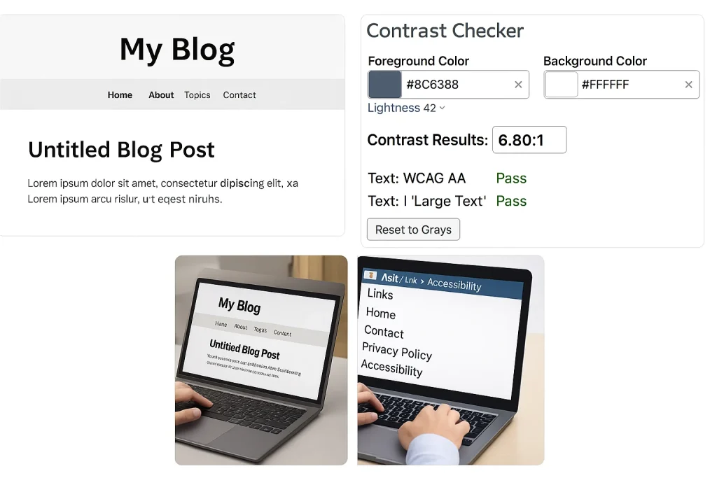
10. Low Contrast Between Text and Background
Grey on white? Blue on black? Even slight contrast issues can strain the eyes.
This is one of the most overlooked but damaging blogging design mistakes for readability.
Fix: Aim for a contrast ratio of at least 4.5:1. Use tools like WebAIM’s contrast checker to test your palette.
Now that we’ve tackled the visual side of your UI Blog Design Mistakes, let’s talk about how people actually use it.
Because even with great colors, fonts, and layout…
If your site is hard to navigate, confusing to explore, or slow to respond, readers won’t stay. They won’t trust you. And they won’t come back.
These are your UX (User Experience) blogging mistakes—the silent deal-breakers that affect behavior, engagement, and growth. Let’s dive in.
Related → 15 Content Writing Mistakes That Hurt Your Blog’s Potential
2- UX Blog Design Mistakes

User Experience (UX) is how your blog feels to your audience. If readers feel frustrated, lost, or unsure about what to do next, even beautiful design won’t save you.
These UX Blog Design Mistakes quietly destroy trust, hurt engagement, and stop readers from exploring more.
If readers can’t quickly figure out where to go, they’ll leave.
Menus with too many options, dropdown overload, or poor labeling all create friction.
Fix: Use a simple top-level nav with 3–5 key items. Add a clear “Start Here” or “Popular Posts” tab to guide new visitors.
12. No Clear CTA or Next Step on Blog Posts
You wrote a great post. Now what?
If there’s no prompt to read more, join your list, or explore a service—you’re missing conversions.
Fix: Add 1–2 CTAs per post. Use internal links, content upgrades, or buttons like “Read next” to lead readers forward.
13. Dead-End Pages (No Internal Links or Suggestions)
When someone reaches the end of a post and hits a dead stop, bounce rate rises fast.
Every page should lead somewhere.
Fix: Use “Related Posts” widgets, in-post links to other articles (like this one on content writing mistakes), and inline prompts like: “Want to improve your blog’s backend? Read this next.”
14. Too Many Menu Items or Dropdown Chaos
Navigation menus should guide—not overwhelm.
If you have 10+ links crammed into your header or layered dropdowns, it creates decision fatigue.
Fix: Keep top navigation minimal. Use categories, “Start Here” pages, and footer links for secondary paths.
15. Not Using a Sticky Header or Scroll-Friendly Design
If readers have to scroll all the way back up to navigate, that’s lost energy.
Modern UX expects persistent access to menus and actions.
Fix: Add a sticky nav bar (your theme or plugins like “myStickymenu” work well). Keep it clean—logo, menu, maybe a CTA.
16. Design Breaks on Mobile (e.g., side-scroll, cut-off text)
Mobile users won’t pinch and zoom to fix your site. They’ll just leave.
Sloppy mobile rendering is one of the fastest ways to repel users.
Fix: Test every layout change on your phone. Use responsive frameworks and preview in Elementor, GeneratePress, or your builder.
17. Text or Buttons Too Small to Tap
Tiny links or hard-to-click buttons frustrate users, especially on touchscreen devices.
Fix: Use buttons that are at least 44px tall. Use full-width CTAs on mobile, and space them for easy tap targets.
18. Pop-Ups That Cover Content on Mobile
A poorly timed popup can kill engagement—even if your offer is good.
Google also penalizes intrusive interstitials on mobile.
Fix: Delay popups by 30+ seconds, use exit-intent where possible, and disable aggressive overlays on mobile.
If your nav doesn’t adapt to smaller screens or collapses awkwardly, readers won’t engage further.
Fix: Use a hamburger menu or mobile nav plugin. Test it yourself: can you reach the most important content with 2 taps?
20. Slow Load Time Due to Design Bloat
Heavy themes, oversized images, and unnecessary animations slow your site—and kill conversions.
Fix: Audit your design using PageSpeed Insights. Optimize images, limit third-party scripts, and use caching (WP Rocket, LiteSpeed Cache).
Read More : → 25 Technical Blogging Mistakes That Silently Kill Blog Growth
By now, we’ve covered the visual slip-ups (UI) and the experience flaws or The UX Blog Design Mistakes that can quietly damage your blog.
But there’s more beneath the surface—design isn’t just about how things look or how users move through your site. It’s also about how much trust, clarity, and accessibility you’re offering.
These final blogging design mistakes are often overlooked, yet they’re just as damaging. Let’s uncover the hidden flaws that could be quietly repelling readers without you realizing it.
Other Critical Blog Design Mistakes Bloggers Overlook
Beyond visual design and interaction flow, trust, structure, and inclusivity matter more than most bloggers realize. These overlooked areas of design can silently erode your credibility, readability, and user confidence.
21. No About Page or Clear Author Presence
Readers want to know who’s behind the content. A faceless blog raises doubt, especially in niches where trust is key.
Fix: Add a simple “About Me” or “Start Here” page. Include a photo, name, and a brief story or mission.
22. No Contact Info or Social Proof
If readers or collaborators can’t reach you, or if they don’t see others engaging with your work, your blog can seem inactive or less credible.
Fix: Add a contact form, email address, and social links. If you have testimonials, media mentions, or reader comments—highlight them.
23. Excessive Ads That Interrupt Reading
Ads aren’t the enemy—but poor placement is.
Popups, autoplay videos, or banner overload destroy the reading flow.
Fix: Limit ads to natural breaks or sidebar placements. Prioritize user experience over short-term clicks.
24. Inconsistent Post Formatting Across Articles
When every blog post looks different—varying heading sizes, padding, fonts—it feels amateur and disrupts flow.
Fix: Use reusable block templates or Elementor sections. Set consistent H1–H3 sizes, image spacing, and CTA placement.
25. Missing ALT Text for Images
ALT text isn’t just for accessibility—it helps SEO too. Without it, visually impaired users and search engines both miss out.
Fix: Add descriptive ALT tags for every image that explains what it is or why it matters.
If users can’t tab through your site (including links, buttons, and forms), it’s not fully accessible—and some readers will leave frustrated.
Fix: Use themes and plugins that follow accessibility best practices. Test with the Tab key to ensure navigability.
27. Inaccessible Color Contrast for Visually Impaired Readers
Grey on white or blue on black may look sleek—but they’re hard to read for many users.
Fix: Use contrast ratios that meet WCAG guidelines (4.5:1 or higher). Check with WebAIM or Contrast Checker tools.
28. Not Using Headings Properly (H1, H2, H3)
Using bold text instead of headings, or skipping heading levels, confuses both users and Google.
Fix: Use H1 once (title), then H2 for major sections, H3 for subsections. This improves readability and SEO.
29. Text Embedded in Images Without Descriptions
Posting text inside an image (like screenshots or quotes) without alt text or context leaves some users—and search engines—out of the loop.
Fix: Add image captions, ALT text, or accompany such images with explanatory content nearby.
30. Not Optimizing for Accessibility Tools (e.g., screen readers)
Ignoring accessibility doesn’t just limit who can enjoy your blog—it may hurt SEO and credibility.
Fix: Use semantic HTML, proper labels for forms, readable fonts, and test your blog with screen reader tools like NVDA or VoiceOver.
31. Overlooked Trust-Building Elements
Beyond contact pages and bios, users want to see social proof, certifications, affiliations, or community engagement.
Fix: Add testimonials, “As Seen On” sections, blog comment highlights, or even a small newsletter subscriber count.
Your footer isn’t just where copyright text goes—it’s the safety net for navigation, contact, and credibility.
Fix: Add quick links, contact details, social icons, and a short description of what your blog offers.
33. Using Outdated or Broken Theme Elements
If parts of your design look broken (missing icons, unstyled widgets), it signals neglect—even if your content is fresh.
Fix: Regularly audit your theme. Test widget behavior, plugin compatibility, and remove deprecated elements.
34. Not Testing Design Changes on Real Devices
Design may look great in your dashboard, but render poorly on different browsers or screen sizes.
Fix: Test your site on mobile, tablets, and multiple browsers (Chrome, Safari, Edge) after every major design change.
35. Not Designing with Readers First
You may love flashy effects or intricate layouts—but if they confuse or delay your reader, it’s not good UX.
Fix: Every design choice should serve the reader. Ask: “Does this help them find value faster?”
Related: → 10 Community-Building Mistakes That Keep Blogs Invisible
Frequently Asked Questions (FAQs)
Q. What’s the difference between UI and UX in blogging?
A. UI (User Interface) is how your blog looks—its layout, fonts, colors, and visual design. UX (User Experience) is how your blog feels—how easily readers can navigate, find content, and trust your site.
Q. Can bad blog design hurt SEO?
A. Yes. Poor UX (like slow load speed, confusing navigation, or unreadable text) leads to high bounce rates and low dwell time—both of which can negatively impact your search rankings.
Q. What’s the most common blog design mistake?
A. Clutter—too many elements on the page, disorganized content, or no visual hierarchy. It overwhelms readers and hides your value.
Q. How do I know if my blog has UI/UX issues?
A. Look for signs like high bounce rate, low time on page, or feedback like “hard to read” or “can’t find what I need.” Also, test your blog on different devices and ask users for feedback.
Q. What’s the ideal font size for blog readability in 2025?
A. Use at least 16px for body text and 20–24px for headings. Ensure good contrast and clean spacing for both mobile and desktop readers.
Q. How can I improve my blog’s mobile experience?
A. Use responsive design, test all pages on phones, simplify menus, and ensure buttons and text are touch-friendly. Avoid intrusive popups and check layout integrity.
Q. How many fonts should I use on my blog?
A. Stick to no more than two font families—one for headings and one for body. Consistency enhances visual trust and makes your content easier to follow.
Q. Should I design my blog first or publish content first?
A. Do both in tandem. A clean, minimal design is enough to start publishing. But don’t wait to perfect your theme—just avoid the key mistakes listed in this post.
Q. How important is accessibility in blog design?
A. Extremely. Accessible design helps all users (including those with disabilities) engage with your content—and it also benefits SEO and user trust.
Q. What tool can help me audit my blog design?
A. Use tools like PageSpeed Insights, WebAIM’s contrast checker, and Google Search Console for UX issues. You can also try tools like Hotjar or Microsoft Clarity to watch user behavior.
Final Thoughts & Next Steps
Blogging success isn’t just about writing great content.
It’s about creating an environment where that content can be seen, read, trusted, and acted upon.
Design is the first impression—and the silent filter.
Before anyone reads your headline, they judge your spacing.
Before they subscribe, they notice your font.
And before they share, they feel how smooth or frustrating your blog was to explore.
These 35 blogging design mistakes—across UI, UX, and trust—are the subtle reasons your blog might feel “invisible” or underperforming, even when the content is solid. But here’s the good news: each one is fixable.
Key Takeaways:
- Clear design builds trust before content is ever read
- UI controls perception—UX controls action
- Mobile-first design is now the default, not optional
- Simplicity, consistency, and clarity always win
💬 Let’s Talk:
Which of these blogging design mistakes have you made—or finally fixed?
Drop your story in the comments below. Someone else out there might be stuck in the same spot—and your insight could help them move forward.